Take our Reader Survey! »
Google Makes Fading Homepage A Little Less Confusing For Unaware Searchers
  • 70 Comments
by Robin Wauters on October 30, 2009

We first reported on Google’s bucket testing of a new homepage that fades to nothing but its logo and the search box after receiving a tip about it at the beginning of this month. Since then, we’ve been getting more and more incoming tips from people who are starting to see this and haven’t seen our or other reports about the gimmick.

I have yet to see the experimental homepage myself, but judging from our inbox and chatter on Twitter the company does seem to be including more people in the bucket test than was the case a couple of weeks ago. Likely, they need to gain more data from actual usage to decide whether or not it can become a permanent feature or not.

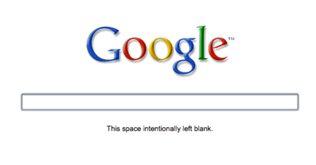
One new change to the fading homepage is the fact that there’s now a short sentence that appears under the search box when the rest of the page fades out. The line, which reads “This space intentionally left blank” was seemingly added because too many unaware users were confused by the fade effect and frantically started disassembling their computers in search of a solution (at least that’s what they do in my imagination). If the point is to remove all extraneous text, adding that message seems like the equivalent of explaining the punchline of a joke. It ruins the effect.

Besides sowing confusion, it is also creating a minor backlash. People who are seeing the fade-out are apparently not big fans of it either. Some choice tweets:

- < google! "this space left intentionally blank"? what is that crap?" > (@adibiase)

- < ..... This space intentionally left blank #google #fail > (@geekant)

- < google is doing strange things right now "this space intentionally left blank" ...odd > (@rpmteacher)

< Am I the only one who sees the "This space left intentionally blank" thing on Google? I think it's creepy. > (@TheJuanReyes)

This is what it looks like now:

And this is the test they ran earlier this month:

Advertisement
Advertisement

Comments rss icon

  • This is one of the foolish changes… whoever gave this idea should be fired..

    How do they expect new users to search through Google if it’s like this…???

    New users would be always looking for buttons to click rather than any other thing

    • They’re probably trying to get people to use the auto-complete feature more and more, so that keywords are more specific to what the user is actually trying to search for.

      Sometimes when you’re searching the web, you aren’t necessarily sure what exactly it is you’re looking for, and the auto-complete feature could help many users actual think out their search queries before performing a search, saving them time to find what they’re really looking for, faster.

      Not a bad idea when you think about it.

    • If one searches for a button one will definitely move the mouse (showing the rest of the UI)

    • I am guessing you believe in design by committee versus by facts. Could this be a stupid change, one person might say yes while another says no. The only way to know is to test it and even the smallest effect that this change has can easily account for millions of dollars in or out of their pocket. Just like how testing hundreds of different shades of blue brought in sizable amount of extra revenue for them.

  • Any scoop on the effect of this UI change to any of the relevant metrics?

    *That* is the interesting part!

  • damn, was this a feature? I was doing ctrl+R multiple times to load the page.

  • To me, it would look like my internet or website is not working for some reason – because I expect to see a button or some links.

    Not seeing anything and refreshing would look like there is a bug. It would cause me to go to bing.com or elsewhere to perform a search.

    I agree – a boneheaded idea.

  • how do i get rid of this crap and revert to the old google page?

    following your suggestion here, i did it, and now i want to undo it; my google access evelny divide maps, images, gmail and web search, and i find it just a bit too annoying to have to move the mouse first to see where i have to move the mouse later to go to appropriate service

  • When I visit Google, it shows the minimalist home page as above but the text below the search box reads “Press enter to search.” instead of “This space intentionally left blank”. Seems a little better to me.

  • I prefer old GUI, At least they would have given search button.

  • Is this for all of the users too stupid to find the browser search bar? Who uses the Google home page, and why?

  • Personally I think the reason they’re rolling it out is the bring peoples attention to the different searches available. Most people are completely oblivious to them.

    Ant

  • Seems pretty cool to me… I have hit enter to search for the last 10 years anyway… seems intuitive

  • This feature is awesome. I noticed it when I installed Chrome in my macbook. You only see a simple and minimalistic google page with a text telling you what you have to do to search something (for newbies), but if you move your mouse you get the old version, so nothing changed. It´s only a good improve.

  • Why would you actually go to google.com when there’s a search box in every major browser?

  • I find it interesting that Google is testing this feature out, especially after recently filing for their search box and two button patent.

  • For me it lasted about two weeks; now gone. This was not a fade into the back ground just a plain page with the search box and Google.

    Wait 5 seconds and all the usual links came back.

    jb.

  • Doesn’t anyone see the joke in this? Remember the times of paper manuals for gadgets – especially the poorly translated korean and taiwanese ones for things like motherboards – used to have a lot of these empty pages, with the text “This page intentionally left blank”. I think it’s hilarious, and noone seems to be getting it :-)

  • I experienced the fading screen a couple weeks ago, but not since then.

    I didn’t really see any use for it. When the page first loaded, everything was indeed faded. But as soon as you move your mouse you can see everything again. I’d say that the majority of people move their mouse before they type their search, even if the search box is already selected.

    I think the fade in/out is more of a distraction than anything.

  • Maybe if they made it an opt-in, people would have a better experience.

    Personally, I like the minimalism of it.

  • Its been happening to me all day at work but only when I go to gooogle.co.uk and I was using ie.

  • What about replacing “This space intentionally left blank.” with, “Type in your terms.” ?

  • We use “intentionally left blank” pages all the time in our manuals.

    Someone even made a web site about it ( http://www.this-page-intentionally-left-blank.org/ )

    I like the nod to print media.

  • I, too, see that page with the “This space intentionally left blank.” message, however as soon as I move my mouse the normal Google home page fades in. I found it interesting that the text is still there for you to copy and paste, but it can’t be seen.

  • When I load google, I get the fade-in version without the “intentionally left blank” joke. And I like it, by the way.

  • Who really cares what they put on there. I don’t recall the last time I actually went to the real Google home page anyway?

  • It happens to me, but I dont get why. It’s blank but as soon as you move your mouse over the page, everything fades in…. So, why does it need to be blank in the first place?

  • Wow, what a bunch of luddite crybabies.

    That said, there should be an easily identifiable link/button to prevent this from being a default for said luddite crybabies…

  • I didn’t see it for myself, but I guess they could do this for performance reasons – logo and search field come up instantly and cached while the rest is downloaded and shows up later as secondary interface which user can wait for longer.

  • The cache thing is the only reason for doing it that makes sense. Unless it was one of those brilliant moments of useless UI changes (i.e. “It’d be cool if it faded, let’s try it!”

  • I have the fade out version but instead of “This space intentionally left blank.” there is a text that say “Press enter to search”. This is with Chrome. In Safari I have the normal version of google’s webpage.

  • Why not put instructions on how to use the page e.g. “type what do you want to search and press ENTER” instead of “page left intentionally blank” :)

  • i like it. i was calling pointless bs before and i just wanted it to be a little bit cleaner or have the option to have no buttons as a setting or pick with buttons as a setting but i can’t. after a couple of seconds the usual homepage times in. i like the minimalism of it all except that the links at the top are gone so for instance i had to just google gmail to get to my gmail (which is really pointless especially on the google homepage. it’s not like i’m searching for hotmail which i usually do instead of typing into the browser bar. i usually don’t have to google gmail because the link is at the top). hmm what else. oh it’s been there since last night/this morning and i hope they keep it that way but fix it so people can choose what they like. they’ve also done it so that here, because i don’t always go to google.com where a search site is already linked within the search box list that pops up/drops down, we can finally just get that feature/get to our search results directly from the search box instead of going to the results page. i like it that way. noticed it’s been on the .com version for a while now but not for us.

Advertisement

Leave Comment

Commenting Options

Trackback URL
Short URL