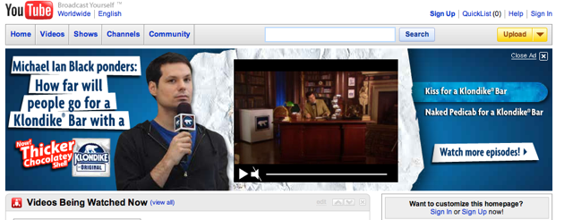
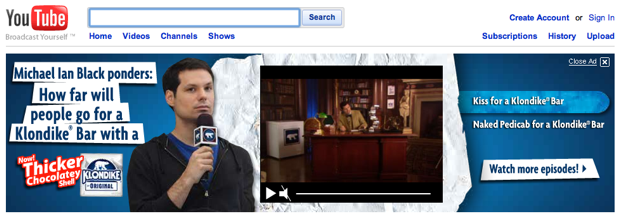
 As the most popular video portal in the world, it comes as little surprise that YouTube is also effectively the second most popular search engine, coming after only Google in overall search queries. With that in mind, it’s a bit surprising that the site hasn’t done a better job at featuring this ridiculously popular functionality — instead of placing the search box at the far left or right side of the screen, as most sites do, YouTube has instead tucked it a bit off center, embedded in its somewhat cluttered masthead. In light of this, YouTube has decided to totally revamp the design of the top of its homepage, and will be rolling out a new version today.
The new version has eliminated most of the clutter and color of the old design, in favor of something that’s unquestionably more Googleish. Before now, navigation buttons like “Home” and “Videos” were likely the first thing people looked at — now, there’s no question that the default action on the site is going to be search. The layout also does a better job categorizing the main features of the site: the left side is now dedicated to finding videos, the right is dedicated to uploading and managing the clips you’ve seen.
It may not sound like a huge deal, but just as very small tweaks on Google can have a major effect, a minor change to YouTube’s design may well change the way people use the site. I won’t be surprised if YouTube sees a marked boost in search queries as a result of the new masthead.
New Masthead
Old Masthead