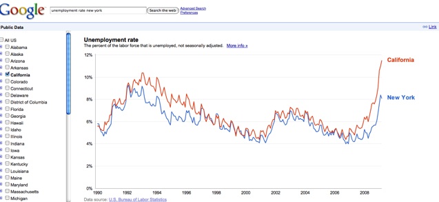
Google is getting fancy with public data in search results. If you search for “unemployment rate New York” or for any other state or county in the U.S., the first result will be the latest data from the U.S. Bureau of Labor Statistics along with a chart. If you click on the link or image it will take you to an interactive chart where you can compare the unemployment rate to other states or counties. For instance, here is New York (8.1%) vs. California (11.5%).
Try it with “population New York” or the name of another state or city, and it will give you the same thing. Google gets that data straight from the U.S. Census Bureau’s Population Division. On the Google Blog, product manager Ola Rosling writes:
The data we’re including in this first launch represents just a small fraction of all the interesting public data available on the web. There are statistics for prices of cookies, CO2 emissions, asthma frequency, high school graduation rates, bakers’ salaries, number of wildfires, and the list goes on. Reliable information about these kinds of things exists thanks to the hard work of data collectors gathering countless survey forms, and of careful statisticians estimating meaningful indicators that make hidden patterns of the world visible to the eye.
So expect to see more data visualizations appearing in search results. The technology behind this comes from Google’s acquisition of Trendalyzer from Gapminder a few years back (this is the same technology that powers the motion charts in Google Analytics, by the way). Here is a video with a demo: