Since the day the original Helio Ocean hit the shelves, rumors were abound that a followup was in the works. 2 years have since passed, countless rumors and leaks have come and gone, and the company that birthed the original has since been acquired – but it’s finally here. Has the wait been worth it?
The Feel:
It’s slightly slimmer and slightly lighter than the original Ocean, but it’s still quite the brick. While that’s outside of the norm when surrounded by phone after phone battling to be the slimmest, it’s definitely not a bad thing. It might not fit well in your pants, but damn does it fit well in your hands.
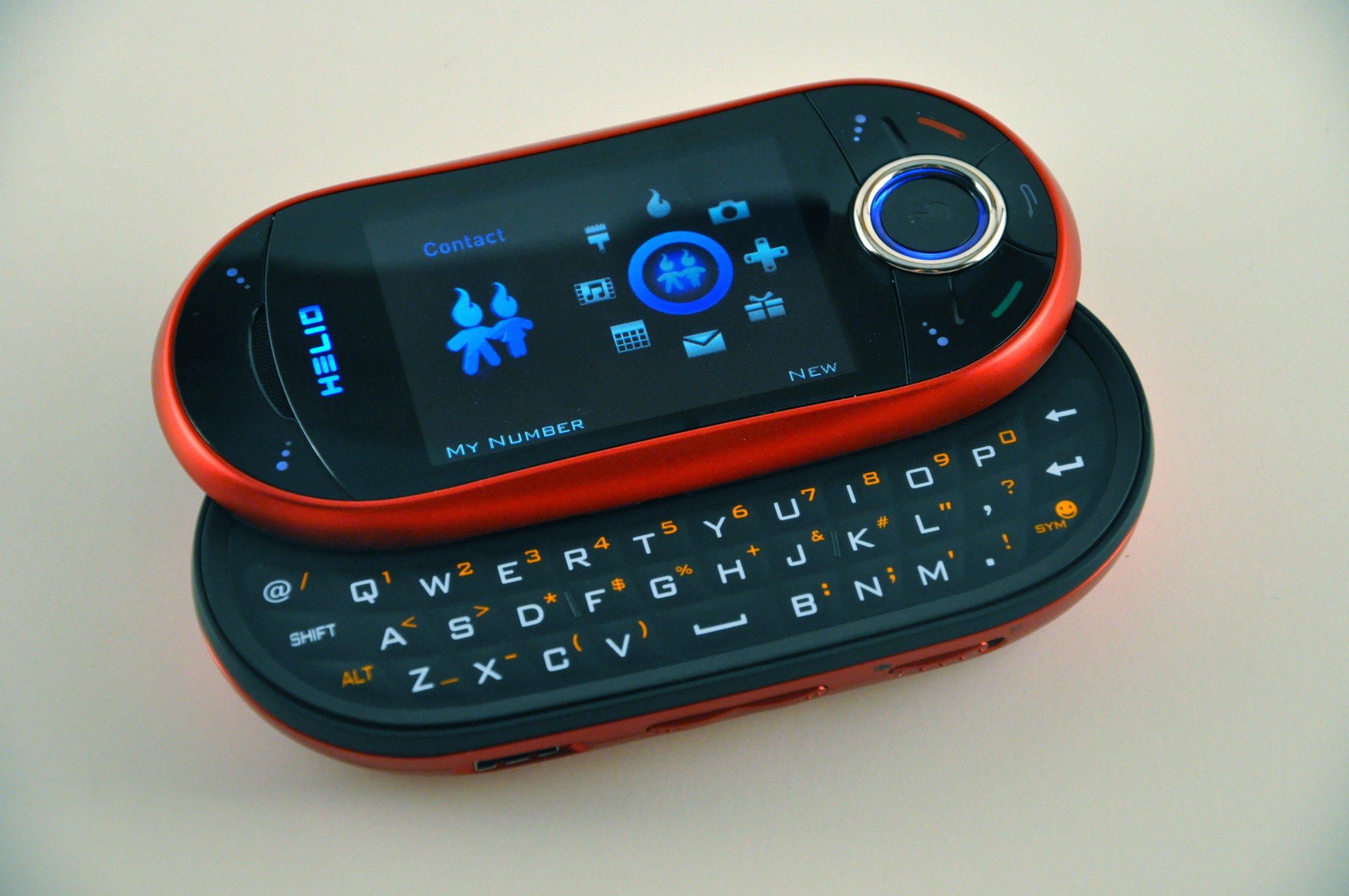
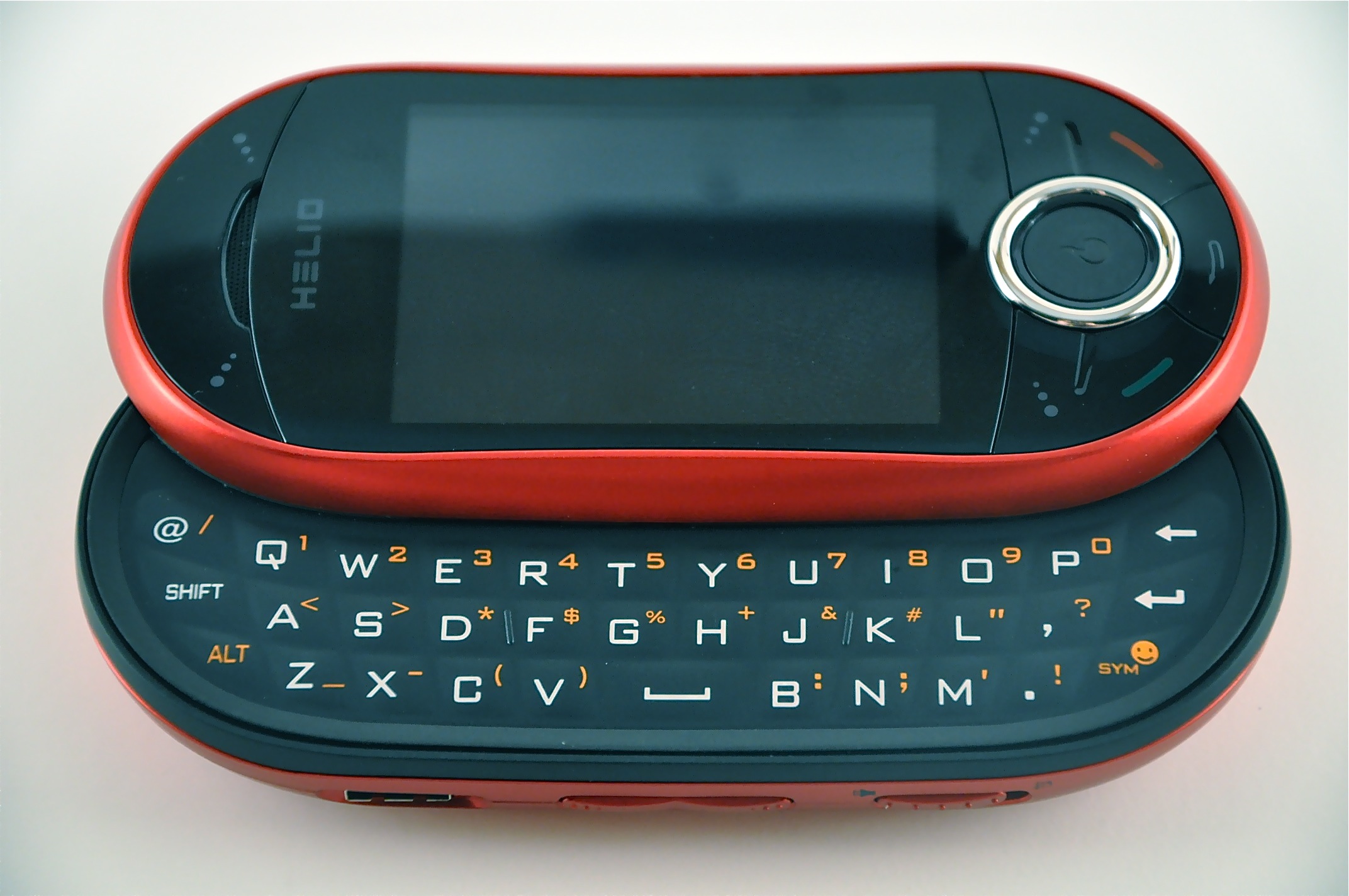
An odd note, but the keyboard and the numberpad have switched places – the keyboard is now the middle layer, with the numberpad now at the bottom. Why? Weight distribution. If you slide into the keyboard on the original Ocean, the number pad is beneath the slid out screen – this adds weight to upper section, making it quite top-heavy while typing. The keyboard is used far more than the numberpad – so if any of the two must suffer from awkward weight distribution, it should be the latter. With the switch, two thirds of the mass is in your palms while typing, giving it a much more properly weighted feel.
To be honest, we’d rather they’d have ditched the numberpad at this point. The dual-slide design was an awesome selling point for the first one – but after years of using the Ocean and barely making use of the numberpad, we’d have done away with the gimmick for the sake of slimming it down a bit.
The Look:
It goes without saying, but the Helio Ocean 2 is a homage to the original. If one were to take the original Ocean and polish out its visual flaws without intending to change the overall look, the Ocean 2 would be the result. It sports the same pill-shaped, dual sliding design, but the hard, straight lines have morphed into smooth curves, matte has become gloss, and the lifted buttons have been displaced (for better or worse) by flush, uniform keys.
As images of the Ocean 2 leaked out over the past few months, the color scheme on display was a black/silver very much like that of the original. Since then, however, it’s been given the new cherry red paint job you see here. We can’t say we’re fans of it – we’d much rather see it in an all black, or any color that isn’t quite so.. dramatic. Fortunately, Virgin has said that such a color option is on the way – eventually.
Hues aside, the Ocean 2 has taken every visual cue from the original and improved upon them in every way. Looks, unfortunately, can be deceiving.
The Face:
Visual appeal comes at the cost of usability. The flush face buttons, which look quite stunning, are notably more difficult to use than those of the original. A millimeter or so has been shaved off to bring them to the same height as the face, removing much of the palpable “Click” that resonated from a button press. This is especially true on the top two “soft keys”, neither of which truly feel like they’re being pushed. As a result of the new button design, I often found myself pressing two buttons at once – generally the bottom right softkey and the end call key, or the bottom left softkey and the call key.
The Keyboard:

The dual-slide design of the original Ocean is what caught people’s attention; the keyboard is what kept them interested. It wasn’t the best keyboard we’d seen on a mobile – the Sidekick series still holds that title in our books – but coupled with the no-limits texting/data included in all (standard) Helio plans, it was untouchable (or, rather, quite touchable. By us. Constantly.)
The Ocean 2 keyboard moves to improve upon the original, dealing with one of the biggest issues: tiny, thumb-killing buttons. The new buttons are significantly larger, with nearly no space on the board wasted. Unfortunately, the keyboard buttons suffer from the exact same flaw that plagues those found on the face. On the original Ocean, each key stood alone; on this sequel, the entire surface of the keyboard is a single slab (which is what allows the keys to be so much larger), decreasing the overall tactility. If you don’t aim fairly close to the dead center of each key, you’ll inadvertently also press the key beside it.
That said, the new keys are much, MUCH easier on your thumbs.
Optical Sensor:
In a world enthralled with touch, it is no surprise that the Helio Ocean makes a move to integrate functionality beyond the standard button press. The transition to a full touchscreen wasn’t going to happen, however, considering what it would require in terms of UI design, hardware implementation, and testing; Helio just didn’t have the financing or the resources to pull it off. Purposed as a hopeful supplantation of a touchscreen is an optical sensor at the core of the D-Pad. The best way to grasp its functionality would be to imagine that of a laptop’s trackpad – except instead of moving a cursor around the screen, the sensor is mapped to handset’s D-Pad directionals.
In some places, the sensor shines. In the navigation menus, for example, the sensor detects gestures big and small. In others it falls flat – namely, the browser, which is most unfortunate. This was one place where the sensor really could have been put to good use. Perhaps we’ve been spoiled by the battle for perfection occurring in the smartphone browser arena right now, but we’d hoped the sensor would grant us the large, gesture-based swooping motions we’ve come to love in Safari Mobile and the Android browser. It does not. Even the largest thumb swoop will only scroll the page marginally, making it quite tough to justify using the sensor to navigate a page rather than the standard directional pad.
The new UI:

As we saw with the never-released Helio Opus, the Ocean 2 has ditched the vibrantly hued “Circus” theme of the original (though you can set it back if you’d like) main menu, opting instead for a black and blue look they call “Dashboard” – and we love it. It doesn’t fit quite as well with the red bezel found on this edition – but be it that Virgin releases an all black color option as we hope they will, the UI and the device will run hand-in-hand as one gorgeous lump of stealthy beauty.
The main menu isn’t the only thing in the software that got some polish; the menus have all been overhauled with gradients and highlights, giving it a much more modern and finetuned appearance.
The Camera:
In one of the more perplexing design changes, the camera on the Ocean 2 has been moved from the horizontal center of the device to the far end. It seems like a trivial difference at first, until you go to take a shot using two hands for the sake of stability. Your left hand will cover the lens.
They’ve dropped the flash, which is a bit disappointing – not because we ever used it for pictures, but because we loved using it as an impromptu flashlight.
Photo/Video Quality:
By today’s ever increasing standards, the 2 megapixel camera comes in on the low to lower-mid range of things. While the pictures it takes aren’t very high res, their quality is better than we expected to get out of a 2mp cam. The shutter is quick, and the interface is intuitive.
The video quality is a bit disappointing, mostly because of odd noise artifacts we experienced in almost every video we took. See the video below as an example – the shooting environment was silent, though you can hear a constant hiss throughout. Sometimes it was this hiss, other times it was a much more annoying buzzing noise. This may have just been an issue with our unit.
The Browser:
While it may not compare to modern smartphone browsers, the Ocean’s browser is one of the better featurephone browsers we’ve used. It won’t compare to Webkit-based stuff, but it’s better than the trash that comes by default on most flips and sliders. And if you don’t like it, it comes stock with Opera Mini – which oddly enough, I’m partly to thank for. (Long story short: I run Heliocity. We figured out how to hack Opera Mini on to Helio. Upon seeing this and the reception, Helio entered talks with Opera Mini to make it official.)
The most significant changes to the browser are its improved start/shutdown times and the ability to turn off “Mobile Optimized” mode. “Mobile Optimized” mode is a commonly complained about feature found on most prior Helio devices which passed all sites through a Google-powered mobile transcoder with a “View in HTML” button at the bottom. In other words, it meant at least 2 extra clicks before you got to see the content as intended. We were quite excited to see that the browser now claimed to rock tabbed browsing – but it doesn’t, really. It’ll keep track of tabs in a “Tab View” screen, but clicking into a tab requires a full refresh of the page. That, of course, completely defeats the purpose, turning it into a weird temporary visual bookmarking system of sorts.
The Chat:
We’ve always loved the all-in-one Ultimate Inbox found on Helio devices, and it only gets better on the new Ocean. Google Talk support has been added to the likes of SMS/MMS, AIM, Yahoo, and Windows Live on the IM side of things, with Helio Mail, Exchange, Yahoo, Earthlink, POP, and IMAP support on the email front. Switching from conversation to conversation in the IM applications is a bit burdensome.
Biggest improvement overall has to be threaded SMS – it makes texting a whole lot more practical which, with the aforementioned all-you-can-eat text plans, is a much welcome change.
The Speakerphone:
Deafeningly loud at the max settings – exactly as it should be. We were able to hear it over the road noise on the freeway quite easily, and could hear the ringtone blasting from another room.
Wallpapers:
This one’s an odd one, but it’s something long time Ocean users will be glad to see: You can now have separate wallpapers for landscape/portrait mode. On the original Ocean, wallpapers (besides those that came on the device) would fit properly only in either landscape or portrait mode – not both. You now have the option to set separate images for each, or crop the same image for proper fitting. Finally!
General Notes and Miscellanea:
– Silence slider: It’s becoming more and more common to see on/off silence switches, and we love that it made it onto the Ocean 2.
– Connection: The charging/data port has changed, both in shape and location. It’s a trivial matter, but Ocean 1 migrants looking to use their car chargers are out of luck.
– USB Charging/Data cable has a little on/off button. Why? We have no idea.
– The Ocean 2 has Bluetooth file transfering – Ocean 1 didn’t.
– Mail for Exchange is now free.
– 3.5mm jack! No horribly annoying dongle required.
Conclusion:
To sum it all up in a single sentence: the Ocean 2 is a rough take on what the Ocean 1 should have been.
There are improvements across the board, but they’re unfortunately small and not without their flaws. That said, the Ocean 2 isn’t a bad phone – it’s just a bit lost. It wants to be a smartphone, but it’s not. As a featurephone, however, it’s easily one of our favorites. If you’re a fan of the original Ocean, a heavy texter, or just looking for one of the best featurephones ever made, the Ocean 2 will fit the bill. It’s a tough sell in a market quickly becoming dominated by incredibly powerful smartphones, but we’re still glad the Helio Ocean 2 is finally making its way to the shelves. Look for it to hit on February 12th at $149.
[PSGallery=2lxrryg7wx]

