oDesk has just released a new part of their site called the oConomy where anyone can view statistics about the outsourcing activity on oDesk.
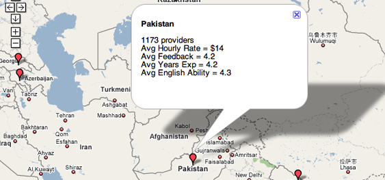
As you can see above, features include the ability to view average working rates, among other data about providers, from around the world on a Google map. You can also view an up-to-the-second metric of how much money has been spent on outsourced projects, as well as graphs of how rates and quality vary over time and providers.
Sure, these stats publicize how well oDesk as a company is doing (you can check out the graphs reflecting its growth). But they also provide a unique, if narrow, look at how the character of outsourcing varies globally. And it doesn’t hurt to check out these figures before hiring someone through oDesk.